01
Research and brief
We learn the business, product, and audience. We define what the identity should convey and where it will live.
We build a visual brand system: distinctive, flexible, and ready for everyday use.
From logo, color, and typography to touchpoints, rules, and a cohesive experience at every contact point.
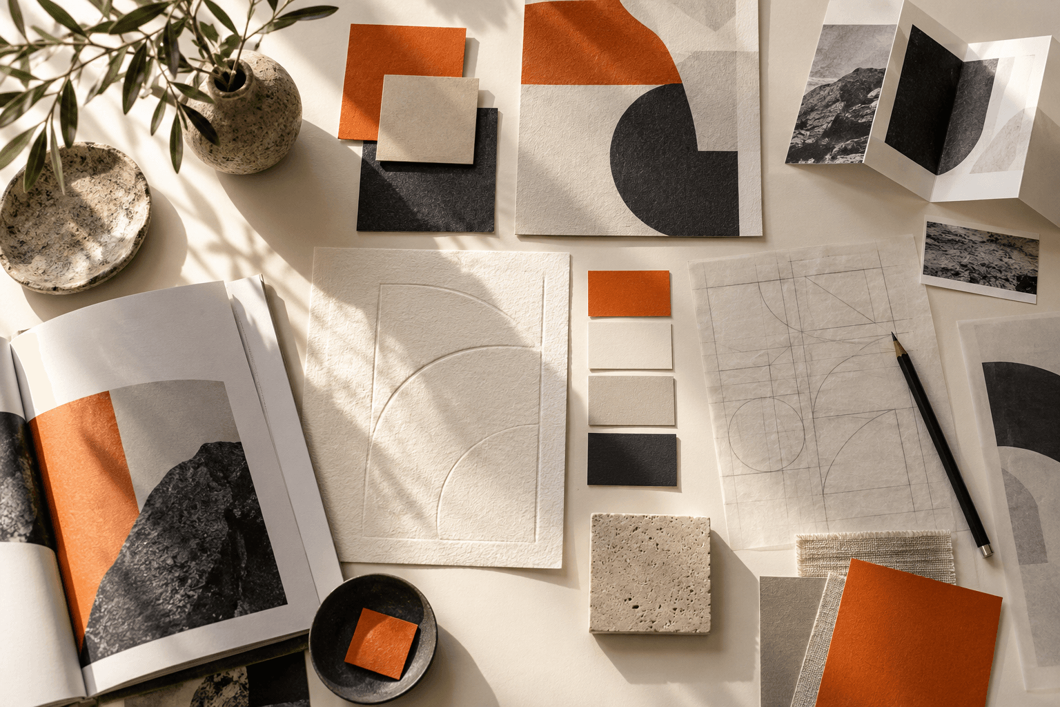
Each element plays its role. Together they create a look that is easy to adapt to different formats and brand tasks.
We learn the business, product, and audience. We define what the identity should convey and where it will live.
We explore images, techniques, and references that support brand character. We align on criteria for the future system.
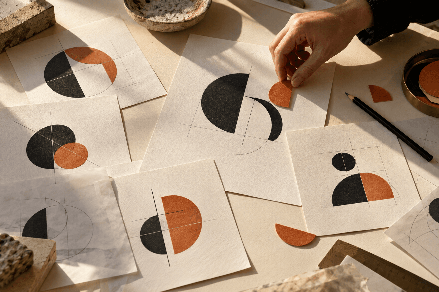
We develop the mark and brand lockup for different scales, backgrounds, and use scenarios.
We select primary and secondary colors and pairings so the brand stays recognizable across environments.
We build font hierarchy for headlines, body copy, and digital interfaces. We account for required languages and readability.
We define composition principles, graphic elements, patterns, or an illustrative approach that supports the brand idea.
We show how the system works on the website, social, presentations, packaging, documents, or in space.
We document identity usage rules and deliver files the team can work with after launch.
A new business needs a distinctive, consistent look for its first contact with the audience.
The current style no longer reflects the product, the scale of the company, or its new positioning.
A separate line or service needs its own system within the existing brand.
Materials are created by different teams, and the brand must look cohesive on every touchpoint.
FOUNDATION FOR DECISIONS
The system helps the brand stay itself on screen, in packaging, in space, and in direct contact with the customer.
ZOND cases across categories. Visit project pages for tasks and delivered solutions.
Real client testimonials from completed ZOND projects.
Digital ResidenceThank you to the ZOND team for working with us on the full brand book, graphic design, and presentation for Digital Residence. It was important that the brand look consistent — from core identity rules to everyday communication materials — so we treated these tasks as one system, not separate design deliverables. We appreciate the team’s attention to our brand and their contribution to how it is represented visually.
BIT SchoolThank you to the ZOND team for the brand book, logo, identity, and brand character for BIT School. We needed a brand that speaks clearly to kids and parents; the character became a distinct layer that adds personality and recognition. We appreciate the systematic approach to the school’s visual identity.
NOVO developmentThank you, ZOND, for the logo, brand book, and identity for NOVO development. In real estate it is essential that a brand inspire trust and look consistent across materials. The team approached this holistically, and we received a coherent system that is practical to use.
KAVLORAThank you to the ZOND team for the branding, website, and content work on Kavlora. For us this project was about presenting the brand as a whole — how it looks, what it says, and how it introduces itself online. That meant working not only on individual visual elements but on the substance of communication. We appreciate the team’s contribution and their attention to Kavlora’s character.
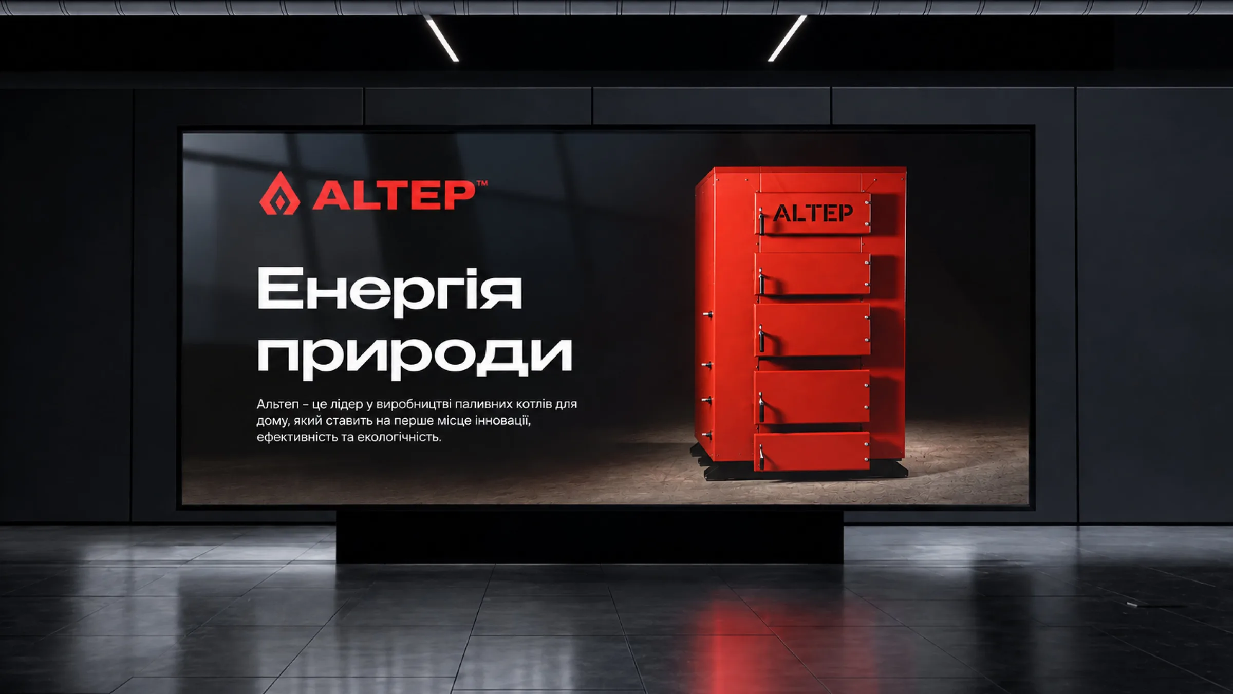
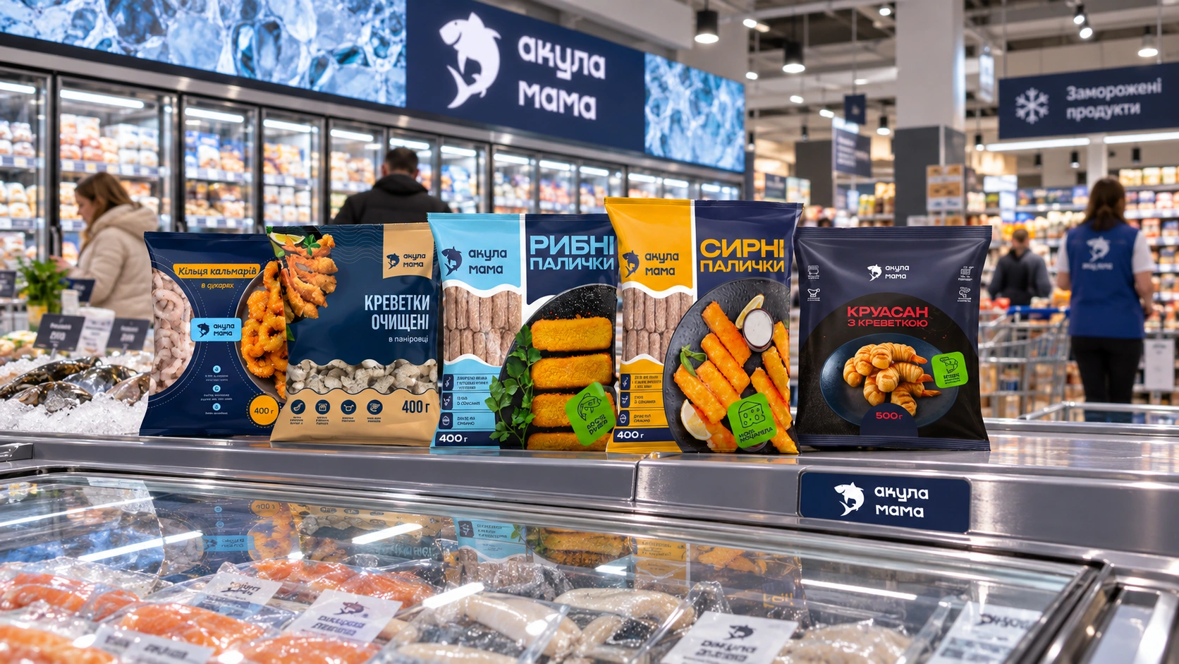
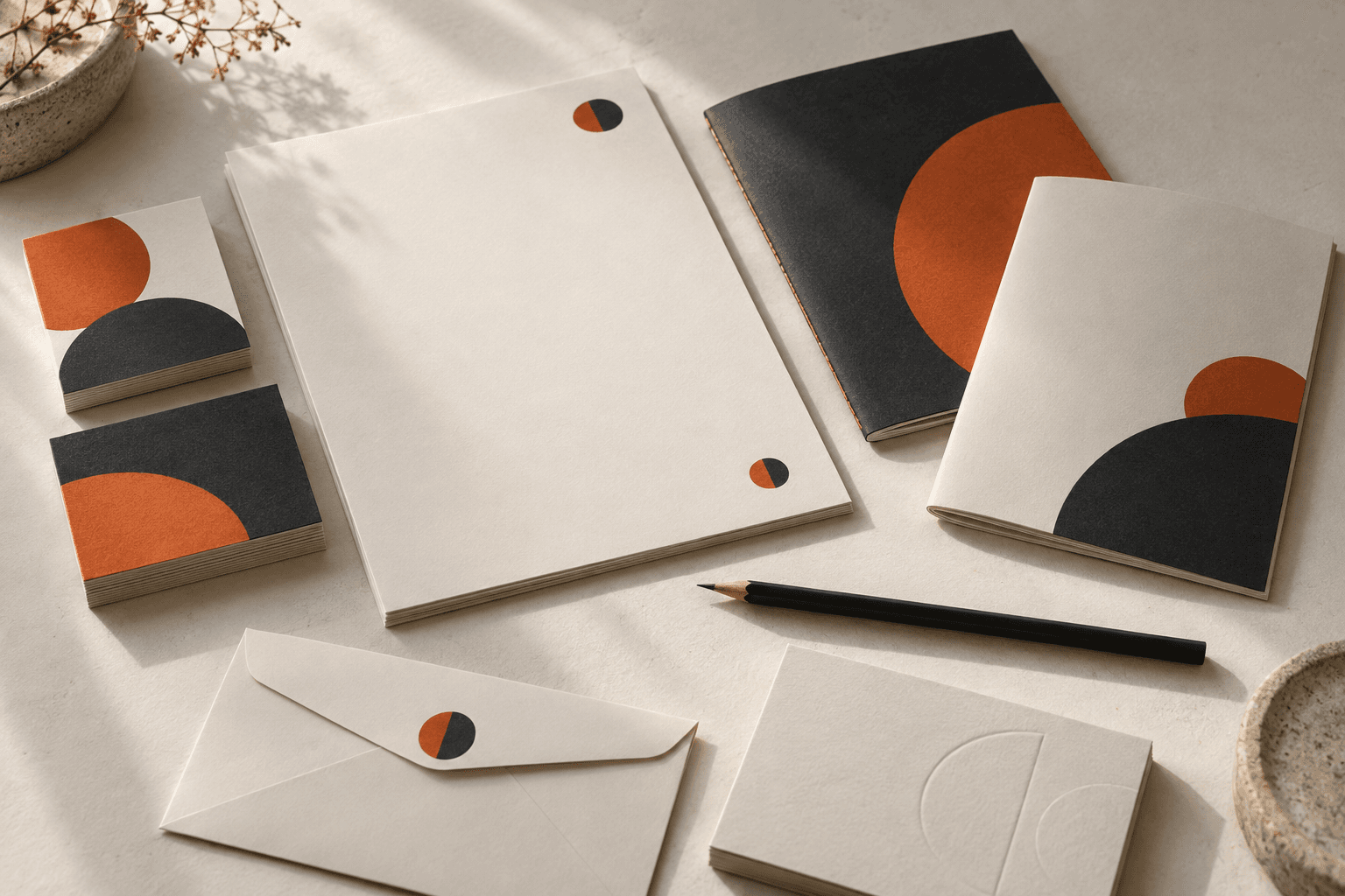
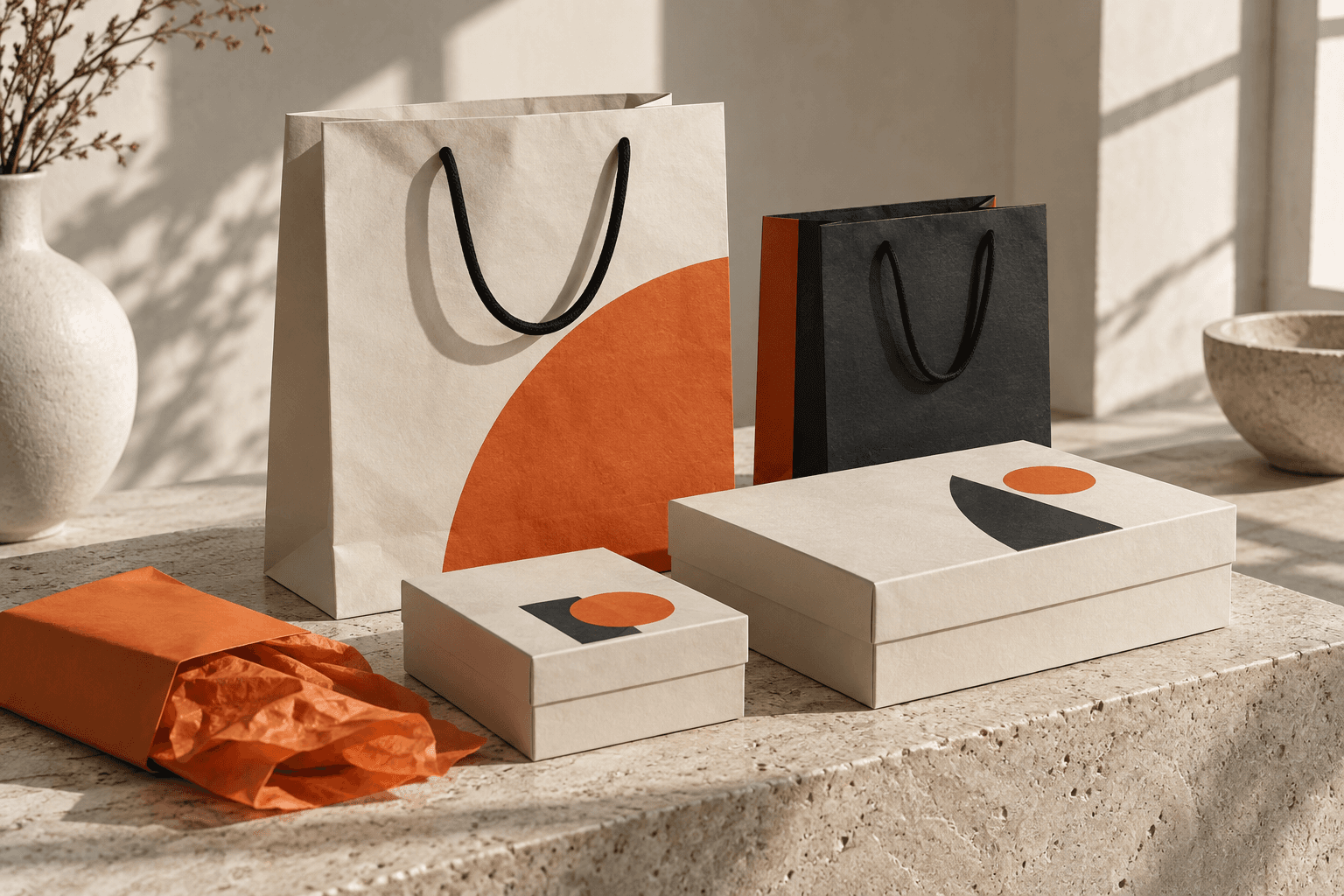
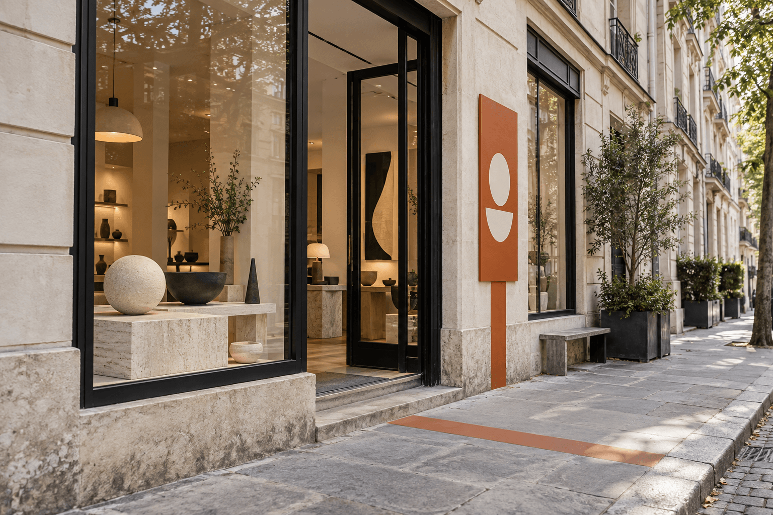
Illustrative concepts show one visual system on packaging, in space, and on business materials. These are not client work.
We discuss the product, business goals, audience, and future touchpoints.
We analyze category context, competitors, and the brand's existing visual decisions.
We shape visual principles and align on the direction for the future identity.
We show how the core idea becomes logo, color, type, and composition.
We develop the set of elements and test it on the required touchpoints.
We prepare files and usage rules for the team and partners.
| Criterion | ZOND | Freelance | Template |
|---|---|---|---|
| Approach | Tailored to the task and brand system | One-off layout | Generic template |
| Strategy | Research and logic | Not always | None |
| Style | One unified system | Author's style | Similar to others |
| Result | Ready to use | Depends on experience | Needs refinement |
Visual concept and rationale.
Logo and the versions needed for different touchpoints.
A system of primary and secondary colors.
Typographic hierarchy.
Graphic elements and composition principles.
Application examples on key touchpoints.
Files for digital and print in agreed formats.
Guidelines with usage rules.
A foundation for extending the style to new channels.
We agree file sets and touchpoints before kickoff, based on the brand task.
Tell us about the brand and upcoming tasks. We will suggest a format for identity development.
Scope depends on the task. Typically we develop the logo, color system, typography, graphic principles, touchpoint examples, and guidelines. We fix the exact list before work begins.
Cost depends on system scope and the number of touchpoints needed. After we learn about the project we propose scope and an estimate.
Timeline depends on the task, number of conceptual directions, and touchpoint volume. We agree stages and schedule before kickoff.
Identity is the visual part of the brand. Branding also covers strategy, positioning, naming, communication, and the brand experience.
Yes. We can define scope to match current needs, though consistent logo use usually requires at least basic color and typography rules.
Yes. We assess what already works, what to keep, what to change, and propose an update scope.
Yes. We agree required formats at project start. After completion we hand over files and usage rules.
Identity is the visual system that makes a brand recognizable. It includes the logo, color, typography, graphic elements, and principles for combining them.
It works when elements do not exist in isolation but support a shared character on the website, packaging, advertising, and everyday materials.
A logo helps name the brand but does not define how every message looks. Perception also comes from color, type, imagery, and composition.
A clear system gives the team freedom to create different materials while keeping a recognizable style.
A consistent look helps the brand feel clear across channels and shortens time spent approving new layouts.
We design elements for real tasks: media formats, publishing frequency, and how the in-house team works.
New products, markets, and teams increase touchpoints. Without shared rules, style quickly shifts from one medium to the next.
Guidelines capture core principles and usage examples so the brand can evolve without losing character.
Tell us about your business, and we will offer a solution tailored to you.