01
Outdated identity
The brand looks outdated next to competitors and holds growth back.
We update the brand so clients recognize you in the new look and stay with you.
Audit, new positioning, logo and identity redesign, brand book, and a transition plan across media.

The brand looks outdated next to competitors and holds growth back.
Product, price, or audience changed, but the image stayed in the past.
A structural change needs one shared brand image.
The brand is hard to tell apart or no longer supports sales.
A full brand refresh cycle — from audit to rollout on media.
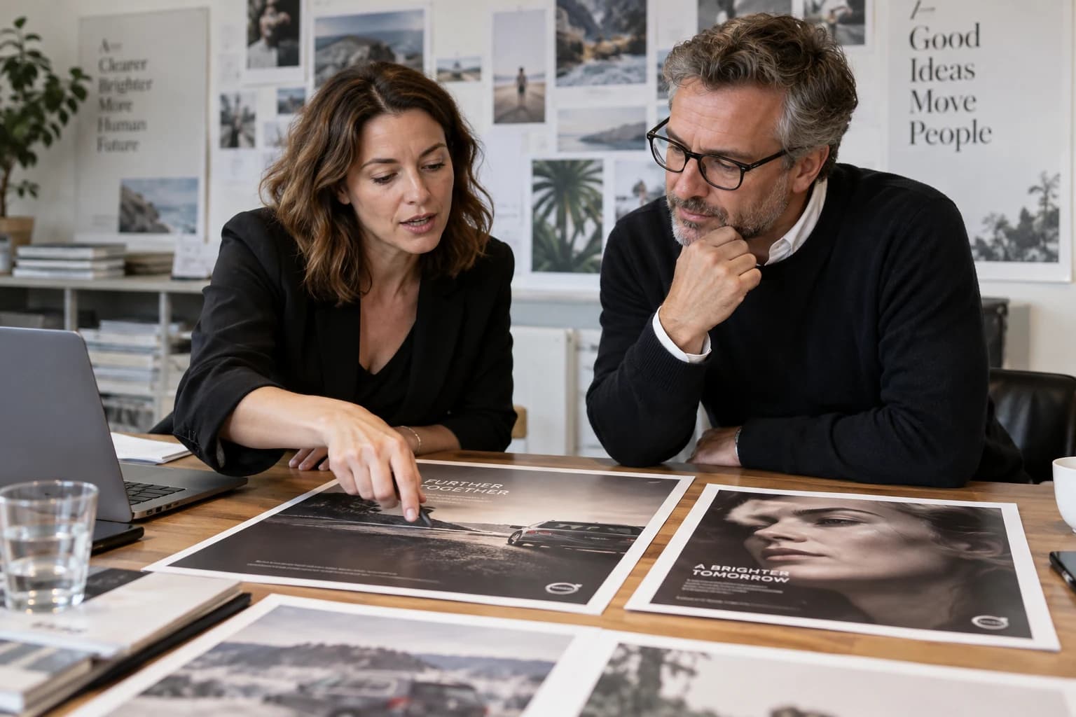
We study brand perception, old-style issues, and file status.

Competitors, category, and how the brand looks against them.
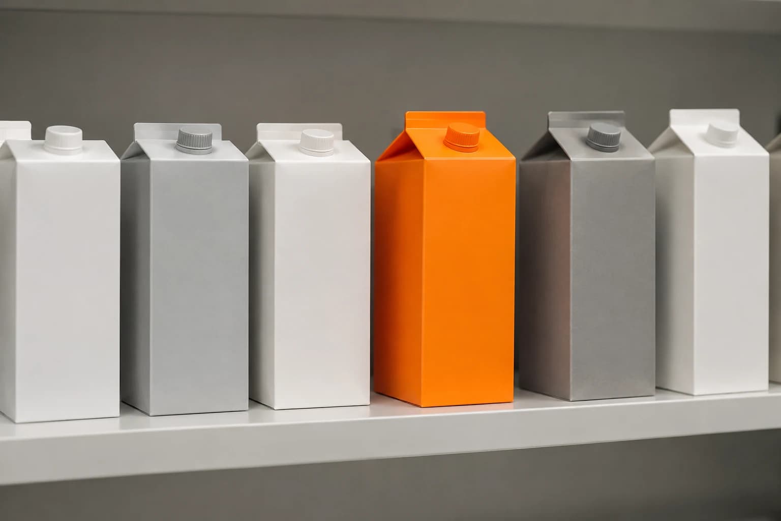
Who the brand serves and what it promises the market.
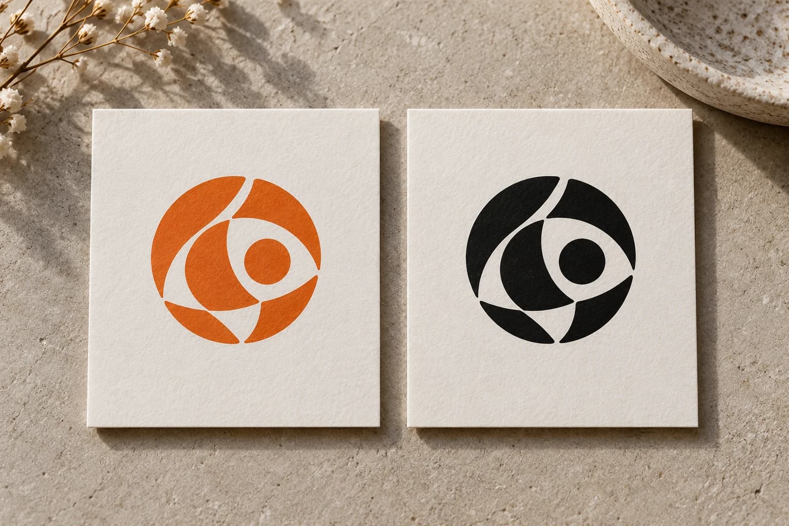
We update the mark while keeping recognizable elements.
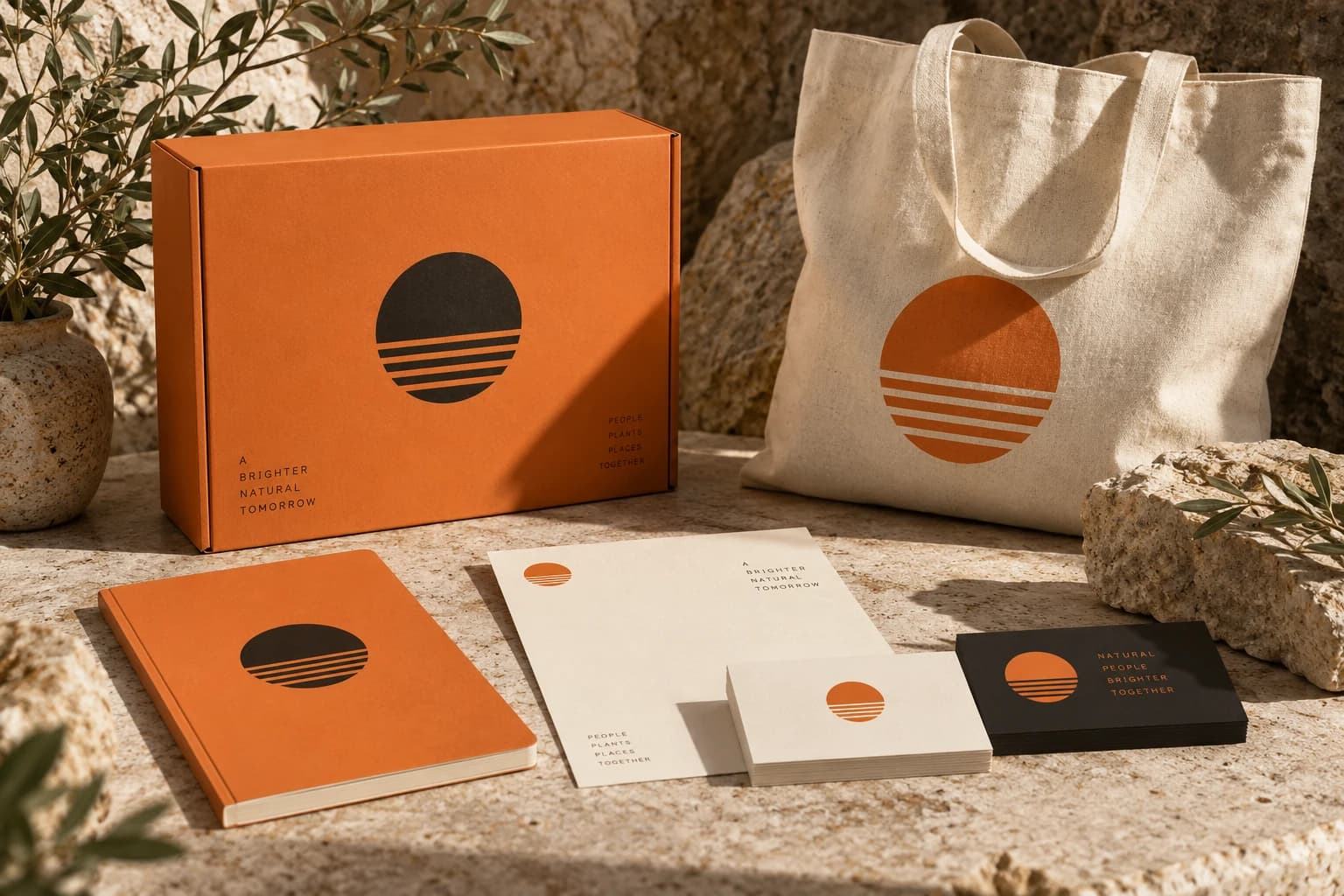
Palette, type, graphics, and media system in the new look.
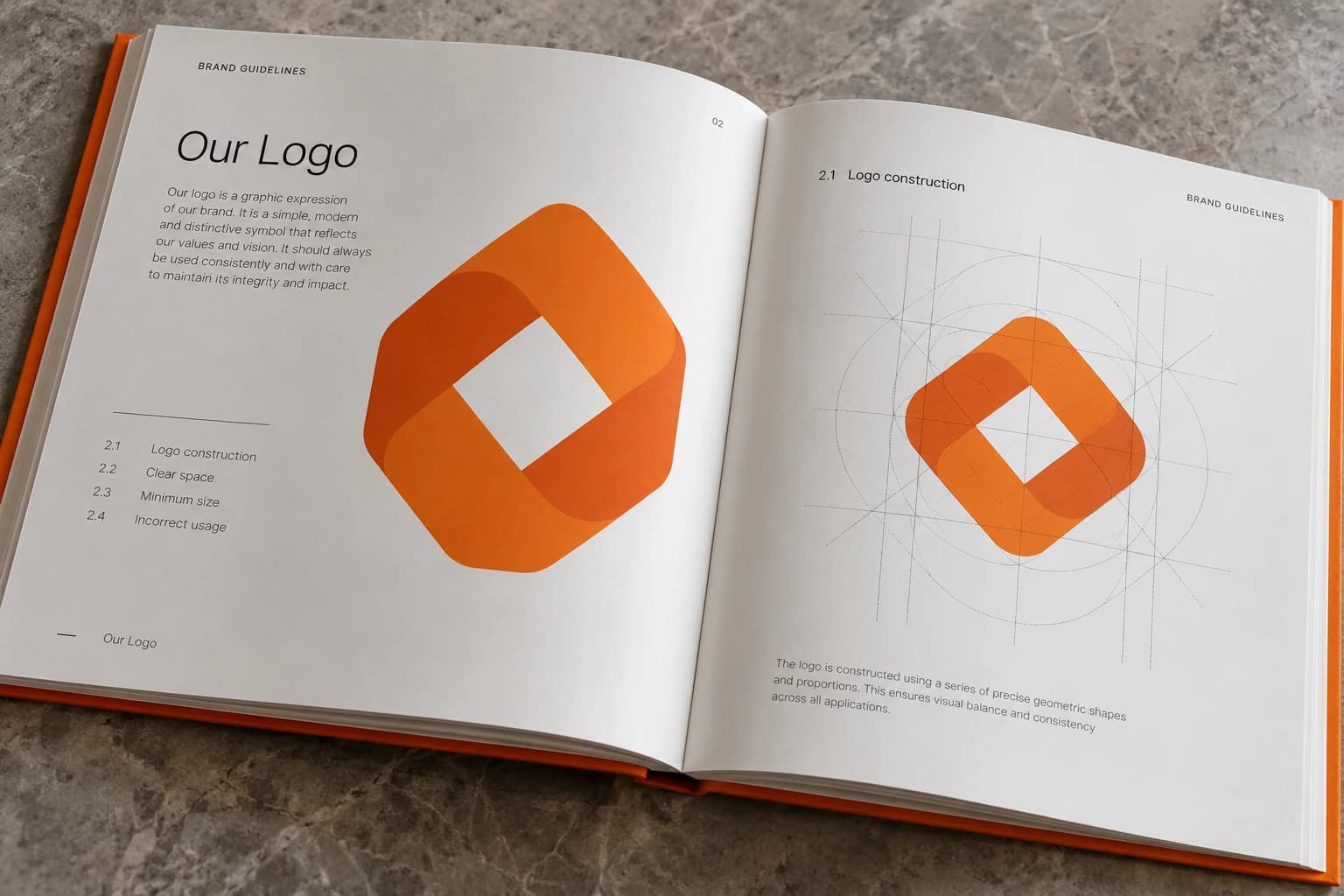
Usage rules so the team and vendors work consistently.
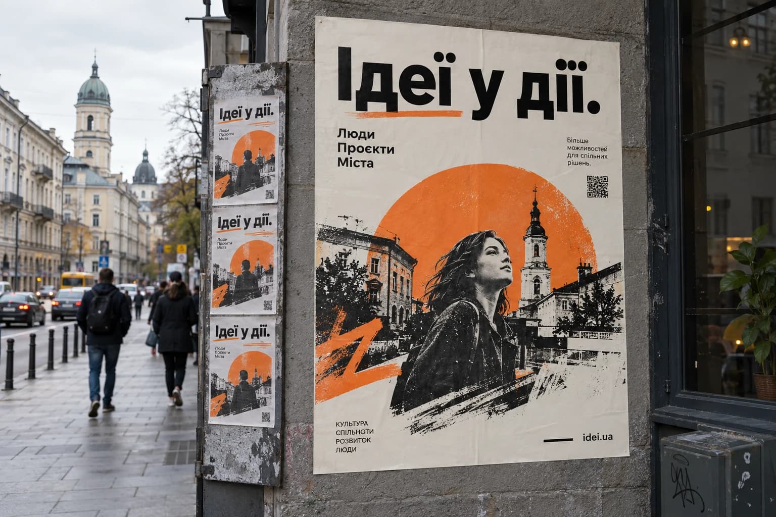
Rollout order and explanation copy for the audience.
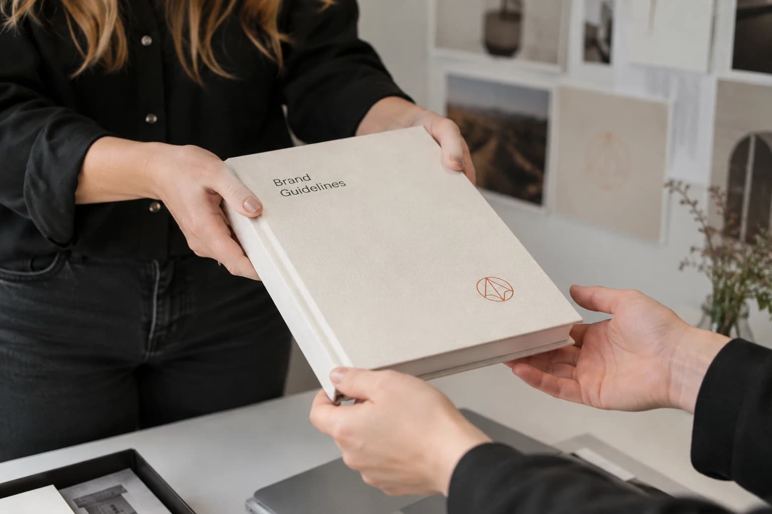
AI, EPS, PDF, SVG, and PNG for print and digital.
Brand refresh examples from the ZOND portfolio.
How the refreshed image looks in communication and on products.
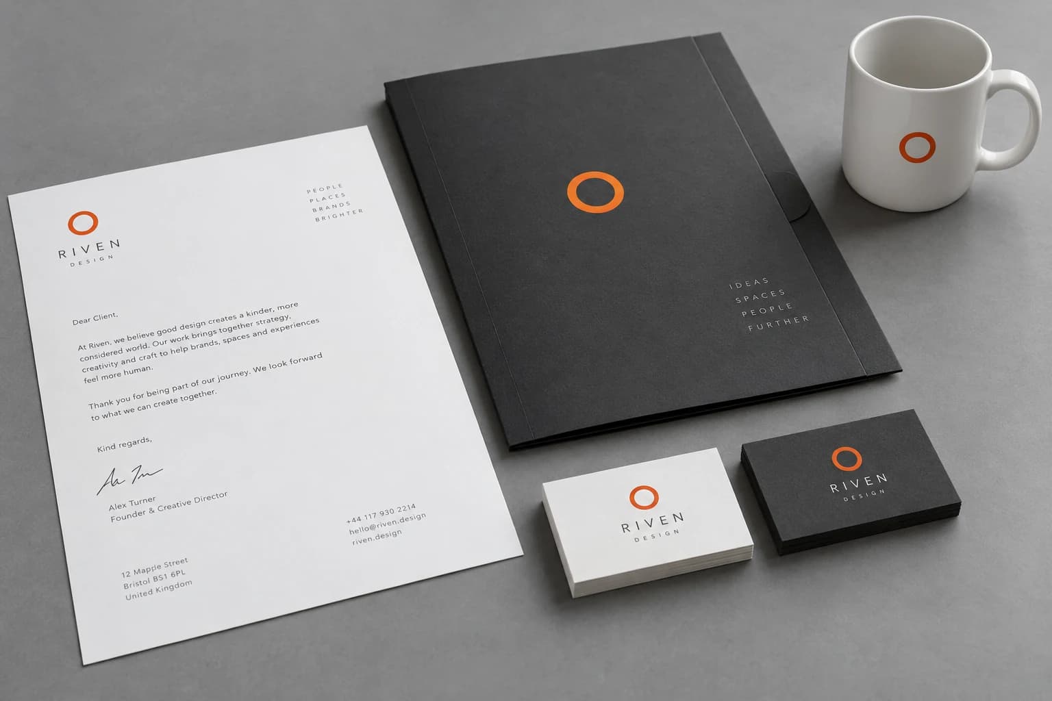
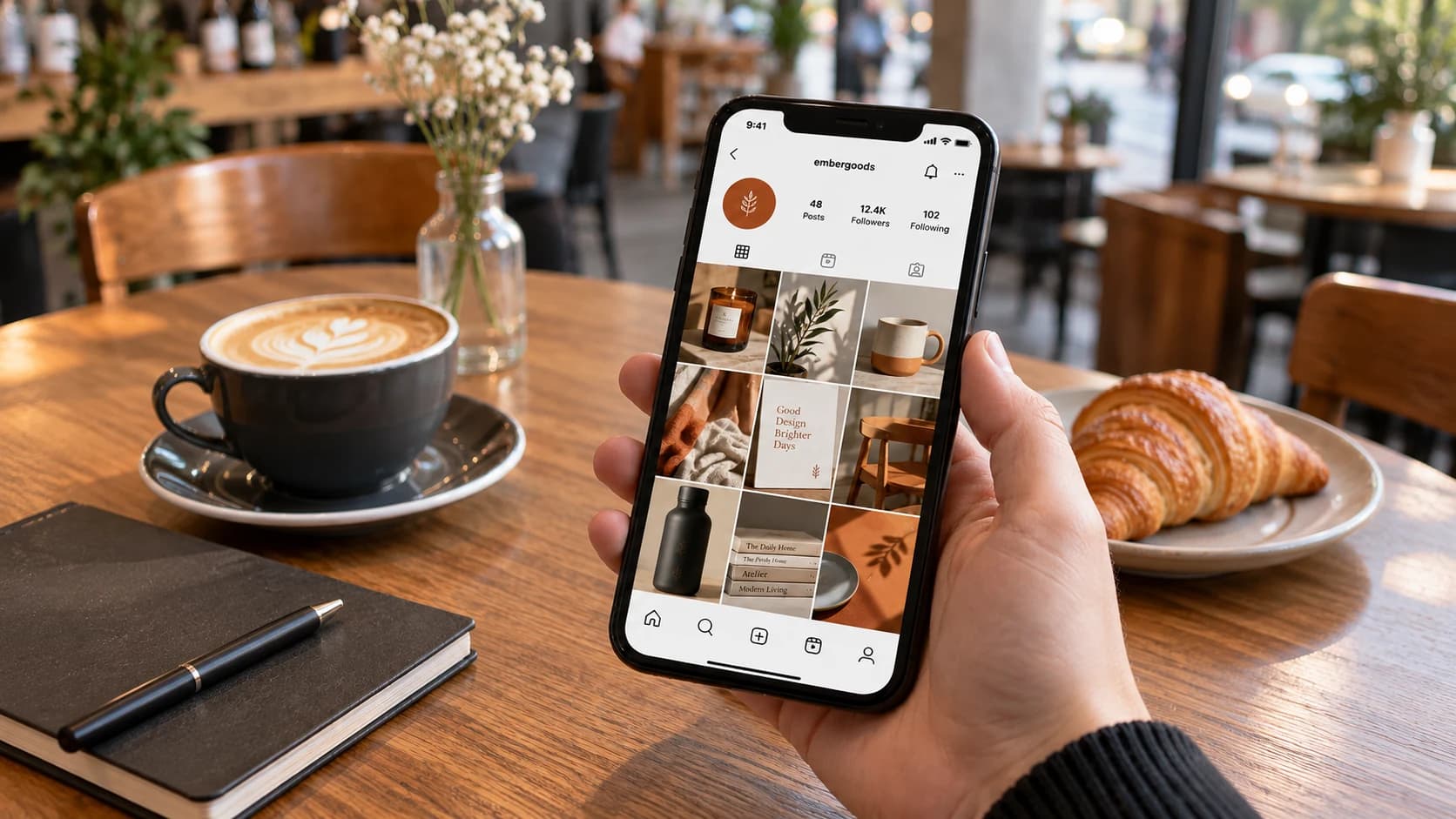

Market and brand perception research.
2–3 daysPositioning and idea refinement.
3–5 daysLogo redesign, type, colors.
2–3 daysMedia demos and brand book assembly.
2–3 daysPrint and digital adaptation.
1–2 daysWe analyze the market and old-style issues before start.
We keep recognizable elements for your audience.
A step-by-step rollout plan across media.
Brand book, guidelines, and media templates.
| Criterion | ZOND | Freelance | Generator (AI) |
|---|---|---|---|
| Input | Audit and data | Client brief | Text prompt |
| Scope | Full system | Separate layouts | One mark |
| Transition plan | Included | Optional | None |
| Rights | By contract | By contract | By license |
Real client testimonials from completed ZOND projects.
Thank you, ZOND, for the full brand book, graphic design, and presentation for Altep. Throughout the project we focused on how the company presents itself to clients and partners and how to apply its visual identity consistently. The brand book, presentation, and other materials are parts of one communication system for us. We are grateful for the team’s attention to these tasks and to the brand’s visual expression.
Thank you to the ZOND team for the branding, website, and content work on Kavlora. For us this project was about presenting the brand as a whole — how it looks, what it says, and how it introduces itself online. That meant working not only on individual visual elements but on the substance of communication. We appreciate the team’s contribution and their attention to Kavlora’s character.
Thank you to the ZOND team for working with us on the full brand book, graphic design, and presentation for Digital Residence. It was important that the brand look consistent — from core identity rules to everyday communication materials — so we treated these tasks as one system, not separate design deliverables. We appreciate the team’s attention to our brand and their contribution to how it is represented visually.
Thank you to the ZOND team for the brand book, logo, identity, and brand character for BIT School. We needed a brand that speaks clearly to kids and parents; the character became a distinct layer that adds personality and recognition. We appreciate the systematic approach to the school’s visual identity.
Leave a request and we’ll start with a free consultation.
Rebranding changes the brand at the meaning level: who you serve and what you promise. Logo, identity, and communication follow that decision. A cosmetic logo tweak is not rebranding.
From UAH 45,000; typically 10–20 working days. Price depends on audit depth, media count, and logo concepts. Estimate after the brief.
Usually 3–6 weeks depending on media scope. Exact timeline is set in the estimate before start.
When the brand image holds the business back — growth, product or audience change, new price segment, merger, or lost positions versus competitors.
Restyling cleans the existing mark; redesign redraws the logo while meanings stay. Rebranding starts with positioning.
No. We keep recognizable elements, roll out media in waves, and prepare audience messaging.
Five stages at ZOND: audit, strategy, concept with logo redesign, presentation with brand book, and print/digital implementation.
Ребрендинг це зміна бренду на рівні сенсів, і саме цим він відрізняється від сусідніх термінів. Компанія наново відповідає, для кого вона працює, що обіцяє ринку і чим відрізняється від конкурентів, а вже під це рішення підбирають знак, стиль і тон розмови.
Рестайлінг чіпає тільки візуальний шар. Знак лишається впізнаваним, а позиціонування та назва стоять на місці. Редизайн логотипа ще вужчий, там перемальовується один елемент, і решта фірмового стилю лишається як була.
Плутанина в термінах коштує грошей. Бізнес замовляє знак, хоча його стримує застаріле позиціонування. Тому ми починаємо з аудиту й показуємо, який обсяг справді потрібен компанії.
Оновлення потрібне тоді, коли образ бренду починає заважати бізнесу. Усередині компанія вже інша, а зовні виглядає так, як десять років тому.
Типові ситуації, у яких приходять за такою роботою.
Є й зворотний випадок. Продажі впали через ціну, сервіс або сам продукт, і новий знак цього не виправить. Аудит на старті відділяє проблему бренду від проблеми бізнесу.
Фіксованої ціни немає, бо обсяг у двох компаній одного розміру може відрізнятися вдвічі. На розрахунок впливають кілька речей.
Через це кошторис збирається під конкретний проєкт. Компанії, якій треба оновити знак і правила його використання, немає сенсу платити за дослідження ринку. Мережі з десятками точок, навпаки, мало самого знака, бо основна робота там у носіях.
На бюджет впливає і стан документів. З готовим брендбуком і вихідниками знака робота починається одразу. Якщо макети зібрані по папках різних підрядників, роботу відкриває інвентаризація файлів.
Головний страх звучить однаково. Нас перестануть впізнавати. Ризик реальний і керований. Перше правило це спадковість. У новому знакові зберігають те, за чим компанію запамʼятали, від кольору до характерної деталі.
Друге правило це черговість. Носії міняють групами. Спершу вивіска, сайт, упаковка й соцмережі, далі реклама, потім документація. Одночасна заміна всього коштує дорого.
Третє правило це розмова з аудиторією. Зміну пояснюють простими словами. Що змінилось, чому і що це дає клієнту. Мовчазне оновлення сприймається як зміна власника, тому тексти ми готуємо разом із планом переходу.
Ця робота рідко буває окремою задачею. Якщо бренд оновлюється повністю, першим кроком іде розробка бренду, бо стратегія задає межі, у яких далі працює дизайн. Якщо відстала тільки візуальна частина, потрібна лише розробка логотипу з адаптацією носіїв.
Після затвердження нового стилю правила збирають у брендбук. Підрядники й нові співробітники беруть готовий документ замість власних версій знака.
Далі йде впровадження на носіях і залучення аудиторії. Свіжий імідж без реклами побачить лише той, хто й так вас знає, тому план переходу стикують з рекламною кампанією, і впізнаваність росте швидше.

Tell us about your business, and we will offer a solution tailored to you.